TAYLOR MISUKONIS


Frye has a long standing visual identity rooted in craftsmanship, authenticity, and timeless design. The photoshoot needed to be guided by a set of visual principals designed to keep the campaign aligned with Frye's identity while still acknowledging the holiday season.
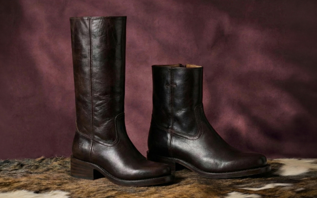
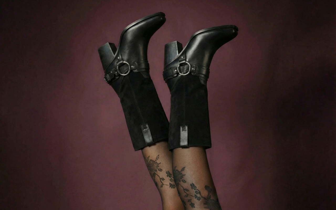
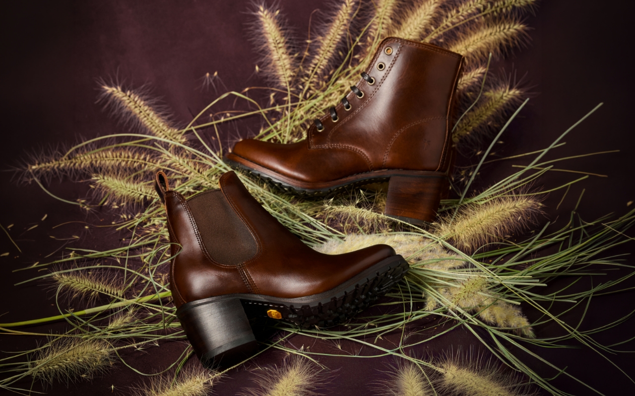
Color became the primary storytelling tool to achieve this goal. Rich seasonal tones suggested the holidays without overwhelming the imagery or distracting from the product. The results needed to feel festive and show-stopping but restrained—something that could live comfortably within the brand year-round.
Because Frye products sit at a premium price point, the campaign also needed to reinforce a sense of value and longevity. For many customers, especially during the holiday season, a purchase like a pair of Frye boots can feel like an investment piece rather than an impulse buy. The art direction needed to support that feeling by presenting the product in a way that felt timeless and considered.
Because the campaign supported the holiday gift guide, the art direction focused on styles customers were already thinking about—especially those that frequently appear on wish lists. Hero products, including the viral Campus boot, were given clear visual focus. At a price point that can range from roughly $300 to $500, these pieces are often considered carefully before purchase. Many shoppers want to feel confident they are investing in something lasting.
The imagery leans into that mindset. Products are presented with clarity, confidence, and presence—reinforcing the idea that a pair of Frye boots isn’t just a seasonal purchase, but something worth committing to. By prioritizing these key styles and presenting them with intention, the campaign supports both the emotional side of gifting and the practical side of shopping.
Color became the primary way to signal the holiday season. Instead of leaning into traditional decorations or overt seasonal motifs, the palette introduced rich tones that subtly referenced the time of year while remaining consistent with the Frye brand. The color direction was intentionally show-stopping without overpowering. Bold enough to catch attention and create visual energy, but controlled enough that the footwear remained the hero of every frame.
Lighting worked alongside color to create warmth and depth. Soft directional lighting highlighted the texture of the leather and reinforced the premium quality of the product. The result is imagery that feels seasonal and striking, yet timeless enough to avoid feeling overly holiday-specific.
The composition direction centered on giving the product space to stand out. References emphasized balanced framing, intentional negative space, and subtle environmental context that supported the footwear without distracting from it. Many Frye customers are discovering the brand for the first time, while others return because they know the heritage and craftsmanship behind the product. With that in mind, the imagery needed to clearly showcase the quality, materials, and silhouette of each style.
Clean compositions allow viewers to focus on what matters most—the product itself—while still creating images that feel elevated and campaign-worthy.