TAYLOR MISUKONIS


The existing Frye digital presence lacked a consistent visual hierarchy and didn't fully articulate the emotional story of the brand. Screens felt constrained by layout limitations, imagery wasn't optimized for storytelling, and product pages didn't communicate details in a way that supported confident purchasing.
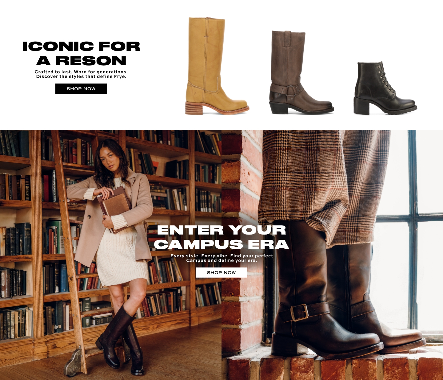
Frye is a heritage footwear brand rooted in craftsmanship and authenticity. In early 2025, we embarked on a redesign of Frye.com to better reflect the brand's legacy in the digital space.
Shopping online today isn't transactional—it's experiential. Buyers aren't just selecting products; they're investing in the story, the lifestyle, and the emotional resonance of a brand. The objective of this redesign was to make Frye's digital experience feel unmistakably purposeful—both visually and functionally—while guiding users more confidently toward conversion.
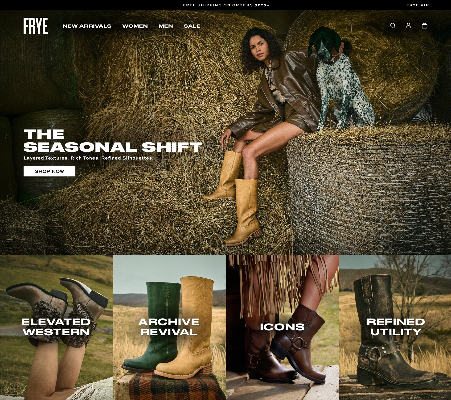
We shifted to a full-width layout to create a bolder, more immersive experience that feels premium—while carefully managing whitespace to avoid visual fatigue. This supports seamless visual scanning and intuitive content progression.
Edge-to-edge imagery on both desktop and mobile provides a high-end editorial feel. We designed layouts so key visuals are never awkwardly cropped.
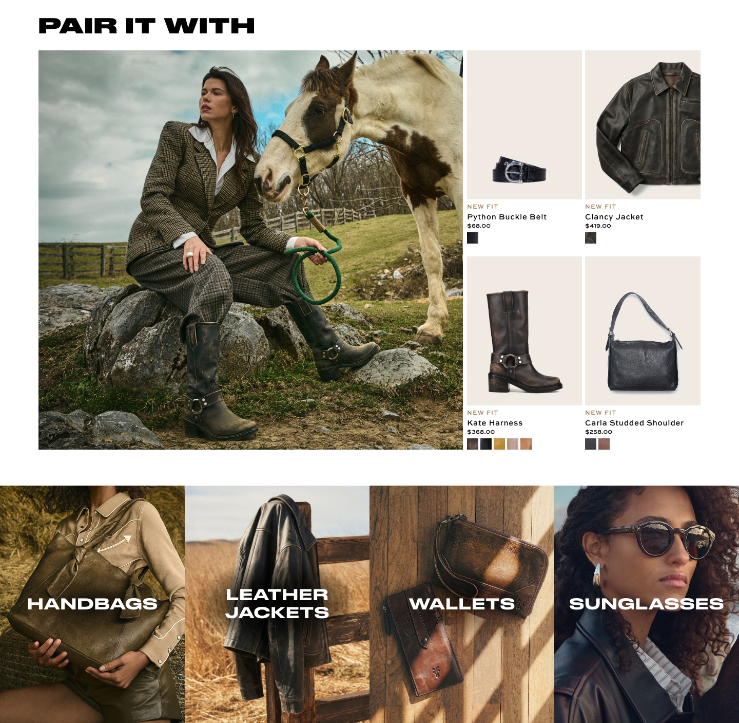
Refined thumbnail displays on collection pages give customers a more accurate sense of product shape and proportion, reducing uncertainty and streamlining browsing.
User-generated content was intentionally incorporated as a core design element to strike a balance between curated luxury and real-world relevance. This bolsters authenticity and shortens the trust gap between browsing and buying.
We streamlines site copy—especially headlined and titles—to be direct and scan-friendly, increasing clarity and reinforcing a modern, editorial tone backed by performance insights.